Spring is in the air! And soon it’s time to celebrate Easter. A great holiday to spend with your family, enjoy the classic Easter brunches, let the kids hunt for Easter eggs in the garden, and exchange gifts.
At the same time, Easter has a lot to offer for email marketers. You’d think it’s not as big as Christmas or Valentine’s Day, but it’s actually one of those holidays that is celebrated worldwide. So whether you want to increase your online conversions or your in-store visits, or even just boost engagement. This famous holiday is the perfect moment to connect with your readers!
Anyhow, let’s hop on to our selection of some eggcellent Easter emails (sorry, we had to) and discover which tactics you can use in your Easter campaigns.
Catchy subject lines
1/ Harry & David
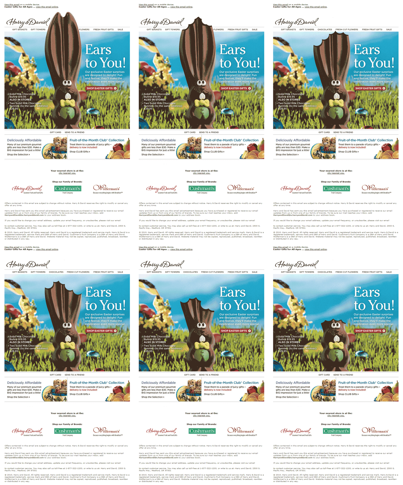
What we like: A fun wordplay in the subject line that makes it about the customer. The gif they used in the email is also linked to the subject line and very amusing to look at.
What could be improved: The email contains too many different messages and CTAs. They could have chosen one main topic with short enticing body text and a clear call to action. Furthermore, there is no one-click-unsubscribe link in this email.
2/ Thrive
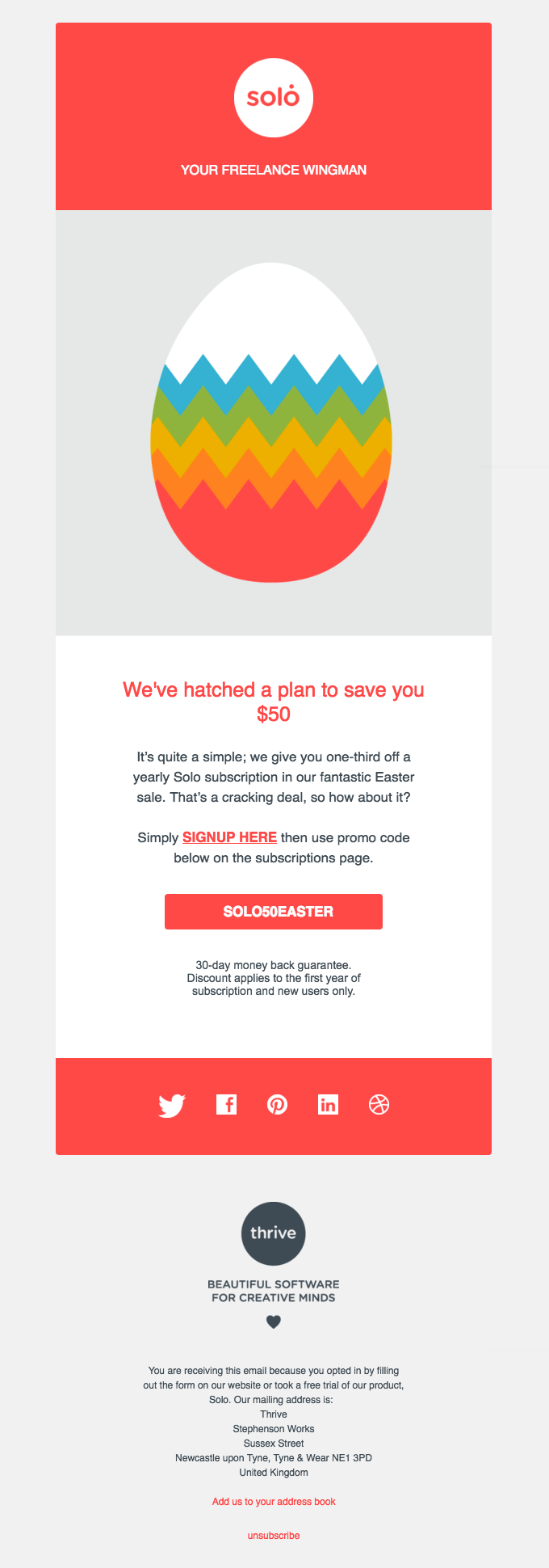
What we like: Clean design and a great subject line. The wordplay is all about the special deal and it relates to the Easter theme. The email is focused on one key message and it contains clear social media icons.
What could be improved: The promo code looks like a call to action while the real call to action is a textlink. This should be the other way around to make it more clear what they expect from the reader.
Amusing wordplays
3/ Crate&Barrel
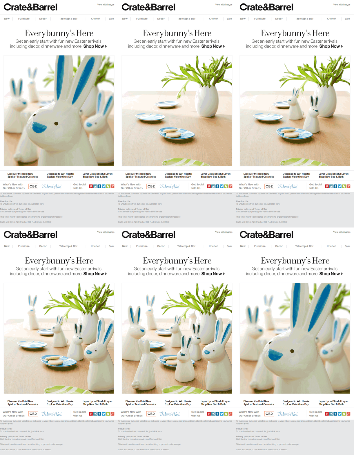
What we like: The CTA is above the fold plus the fun title (everybunny’s here) that is connected with the brightly-colored gif.
What could be improved: The email focuses mostly on the image, while the CTA seems to be pushed to the background. It would be better if the main CTA was bigger and bolder. There’s also a lot of cluttered information (like different CTAs) right above the footer area that might distract from the key message.
4/ Jack Threads
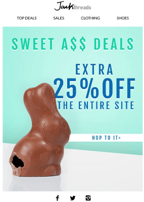
What we like: The funny title is directly linked to the image, there is one clear message and CTA focusing on a special Easter deal, and the mail is full of bright spring colors.
What could be improved: The email is pretty generic. Even though they have chosen a fun way to introduce an Easter sale, they could’ve added some best selling products to make the deal more tangible.
Images with vibrant colors
5/ Julep
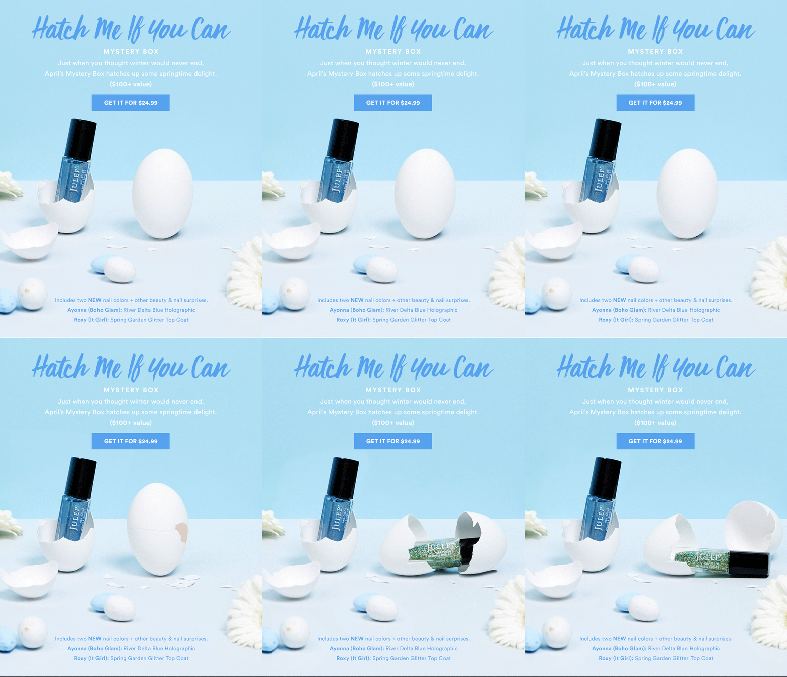
What we like: Bright spring colors, creative wordplay in the title and an animated image all make this email very attractive.
What could be improved: The CTA button is a shade of blue which disappears in the rest of the email. They could’ve used a different, more popping color.
6/ Personal Creations
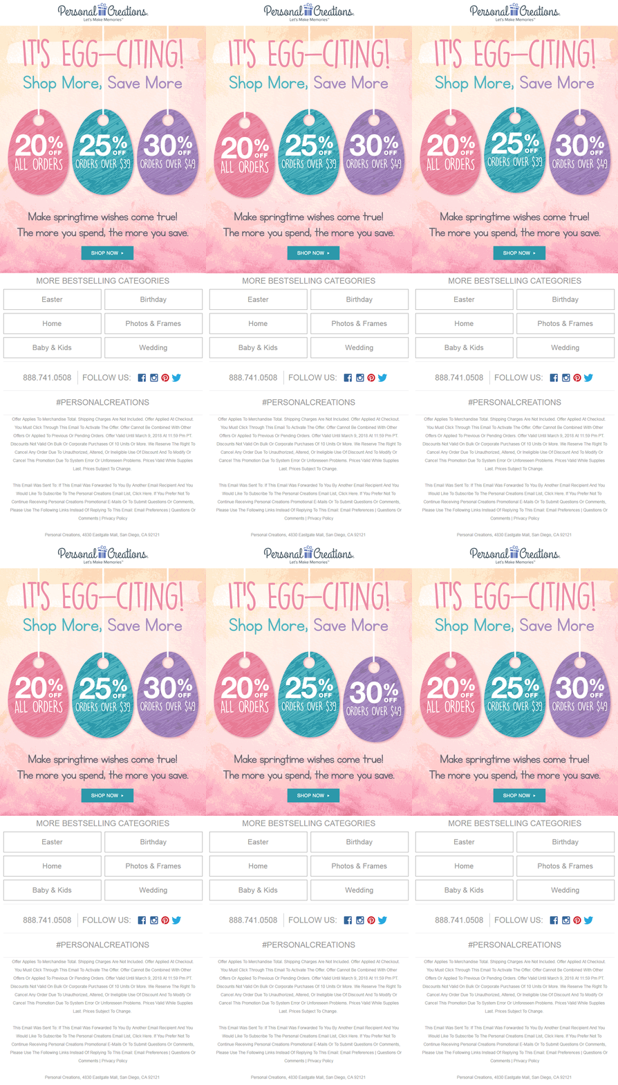
What we like: This email is a perfect mix of everything. It blends pretty spring colors and uses fun wordplays, but it also shows different Easter deals and adds their bestselling categories.
Sparking inspiration
7/ Fortnum & Mason

What we like: This email is as amusing as it is creative. F&M show their products in an original way (thanks to the quiz) which inspires readers to pick out a gift. They also added special events and social media icons in a clean way.
What could be improved: This email relies mainly on images. If a mail client doesn’t support images or the reader blocks images, the whole email loses its purpose.
8/ Yankee Candle
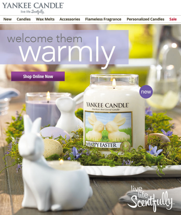
What we like: This email really displays the spring vibe thanks to its copy and the colorful images. It’s an inspiring way to promote their products as a helpful asset during Easter.
What could be improved: The email is a bit hectic because of all the images and text. This leads to the fact that the CTA button doesn’t stand out.
Offering special treats
9/ Rifle Paper Co.
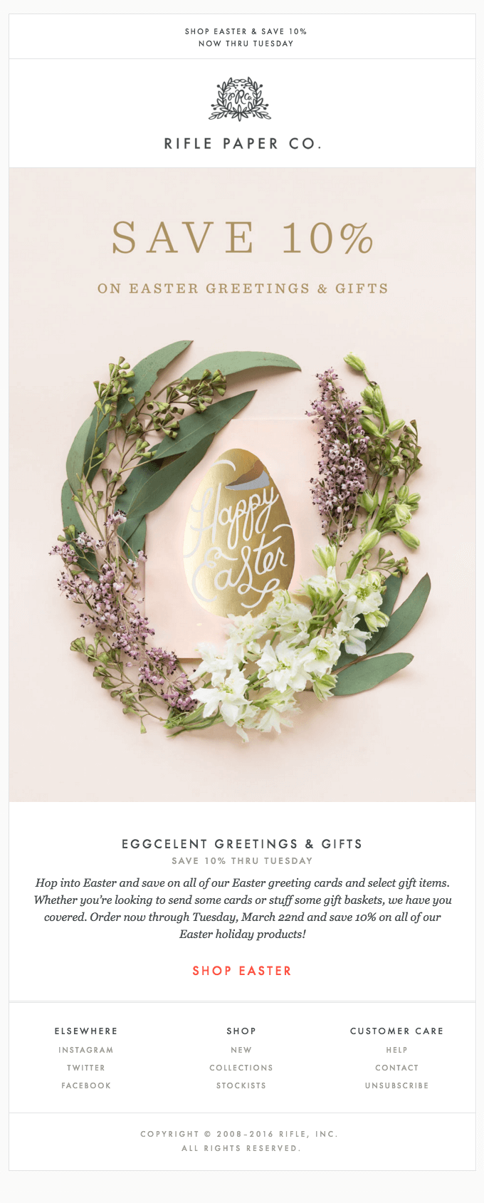
What we like: This one is clean and simple. The design is elegant, it has fun copy, and the promotional deal is clear and visible.
What could be improved: The CTA button is found all the way down and isn’t that visible. They could have used a bigger font to make it stand out even more. Adding a CTA button in the image would be a good move as well.
10/ Trivago

What we like: It matches Trivago’s branding perfectly with clear CTAs throughout the mail. They used a cute image with a relevant headline to keep up with the Easter fever. What’s more is that the search bar also works as a call to action.
Do you feel like your brand isn’t really associated with this specific holiday?
That doesn’t mean you can’t still hop on the Easter train to inspire your readers. Have a look at our final example of impressive Easter emails.
11/ Curries Online
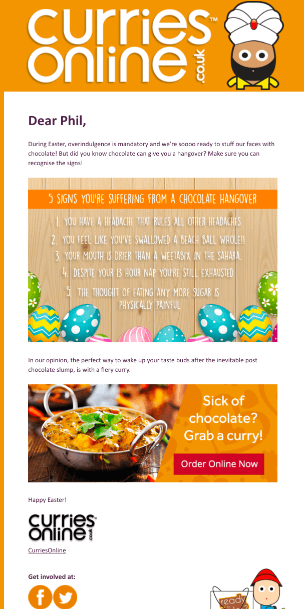
What we like: Their approach to Easter is different from their competitors, but it is still on point and relatable thanks to the funny copywriting. A great, nonconventional way to link Easter to their own products.
Hopefully you’re full of inspiration by now. Just remember, the end goal is to keep your Easter emails light and fun. Because that’s what spring is all about!
We’re really curious about what you think of these emails. Which one is your favorite? And how are you planning your Easter email campaigns?
We look forward to your comments!
1 Comment
Comments are closed.