So, you have a beautiful website with amazing products, compelling texts and attractive visuals. And you know people are browsing your pages, looking at your products, even putting them in their shopping cart. But then… nothing. Frustrating, isn’t it?
Research has shown that cart abandonment is a common problem for every ecommerce business. Statistics show that in general 7 out of 10 people drop out of the buying process. Luckily, there is a way to get your customers back into buying your product thanks to the cart abandonment email.
This type of email is usually sent automatically right after the customer left their shopping cart. We won’t explain what a cart abandonment email is, because we know you know. However, we will give you 3 reasons why you should implement cart abandonment emails in your marketing as well as a few key takeaways on how to create the best cart abandonment emails possible. On top of that, we give you 4 impressive examples that blew us away. Let’s dig in.
Why you should consider cart abandonment emails
Win back customers
Did you know 75% of shoppers who have abandoned shopping carts say they plan to return? Talking about a silver lining!
So it’s up to you to motivate those shoppers to return to your website and actually buy your product. Whether it is a simple reminder for customers who got distracted or giving an incentive for the hesitant customers. With cart abandonment emails you have a great opportunity to bring them back to your store. Not only will this help you to retain customers, it also helps decrease the cost of attracting new customers.
Improve your customer experience
Sending out a cart abandonment email is a great way to figure out why your shopper didn’t finish their purchase. This can be for a number of different reasons so it’s interesting to find out what went wrong during the buying process.
With this information you are able to uncover and solve potential issues to improve your customer’s experience. Consequently, it may lead to more trust, more loyalty and less cart abandonment.
Improve your customer relationships
Besides improving the customer experience, sending cart abandonment emails allows you to improve your customer relationships. We explained before that it is a great way to reach out to your potential buyers. Thanks to this type of emails you are able to help them out and interact with them on a more personal level. This increases the relevance of your brand by building a relationship with your customers. Again, this will boost your brand loyalty and trust which as a result can help with future purchases.
Our 5 tips for creating high-performing cart abandonment email campaigns
Before we show you our selection of great cart abandonment emails, we will quickly point out a few key elements of cart abandonment emails that really can make a difference in your campaign results. Remember, as with all your emails, it’s best to test each of these elements to see what works best for your brand and your audience.
1/ Get your timing right
When you send out cart abandonment emails, you can choose to send just one or opt for a sequence of emails. Whatever you decide to do, it’s always best to send the first email within a couple of hours. People sometimes get distracted or start checking out other websites before finishing their purchase. So it’s important to keep your brand/product top of mind.
Other emails can be about creating a sense of urgency (“Watch out. The product you chose is almost sold out!”), motivating your customer with some kind of incentive (“We don’t want you to choose between 2 products. So here’s a discount so you can enjoy both.”) or giving a motivation with social proof (“Here’s what other buyers have to say about this product.”). The period to send these emails can take up to 5 days.
2/ Use compelling text
Start with an impactful subject line. After all, you want people to open your email. This can be something standard like “Did you forget something?”. Or you can do something different to spark curiosity, “Is something wrong with your internet?”.
And don’t forget about your body text. You don’t want to make it too salesy, but it’s important to keep your message to the point. Depending on your brand style, you can go for a humorous tone or a more serious one. In the end, it’s about providing a positive reinforcement for your customers to finish their purchase.
3/ Show the abandoned products
Some brands seem to forget about this, but this is actually an essential part of the cart abandonment email. Most people are pretty busy nowadays so they might not remember what they put in their shopping cart. Adding the products in this type of email is a great reminder. Extra credits if you use pictures since they are processed way faster than words.
4/ Add a striking CTA button
As you know, every email you send has to have a clear goal. That’s what the call-to-action button is for. When it comes to cart abandonment emails you want your customer to finish their purchase. So the CTA button has to lead your customer back to the point where they dropped out. Keep it short and simple, but try to grab the attention with a catchy CTA so your customer knows what they’re missing out on.
5/ Provide customer support
If someone abandoned their shopping cart, it could be because something went wrong during the checkout process. Maybe some kind of technical issue occurred, or maybe the shopper encountered other barriers that kept him/her from buying. So it’s always a good idea to find out what went wrong. Which is why it is important to offer customer assistance in case your customer has any questions or struggles.
Examples of awesome cart abandonment emails
Whisky Loot

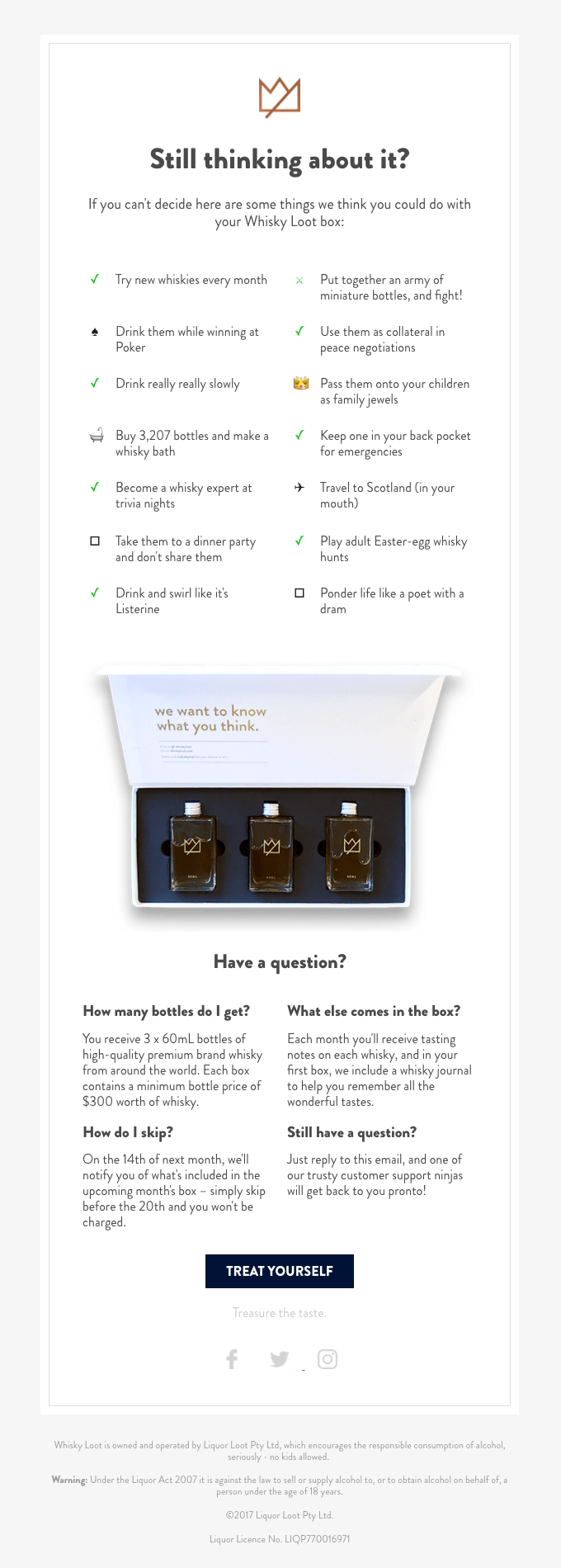
This cart abandonment email from Whisky Loot has a clean design and clear structure. Their subjectline is brilliant and we absolutely love how they framed the fact that you might be doubting about your purchase. Their copywriting is on point, humorous and it motivates the reader to try their product. They also added answers to some frequently asked questions to persuade the customer. And in case you’re still doubting you can reply to the email for any other questions.
We would suggest to add a CTA button higher up and give it a different color to make it stand out more.
Adidas

Technically, this is a browse abandonment email. An email that is sent to a customer after you’ve noticed that (s)he’s been looking extensively at similar products or categories.
However, the tactics used in this email are perfectly applicable to cart abandonment emails.
First, your attention is captured by a big product visual and a compelling headline. Adidas provides clear context and offers you two options: shop the product or customize the product to your specific style.
Then they add customer reviews about the product to build trust and to lower the barrier of buying.
Adidas also added some extra useful links at the bottom of the email: shortlinks to their customer support, your profile preferences, social links and their store finder.
Dollar Shave Club

Subject line: “Where did you go?”
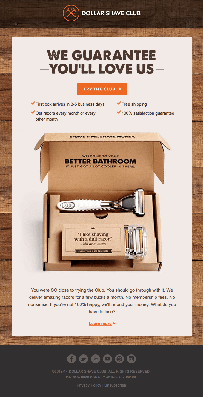
Dollar Shave Club has a proven track record of emails that are beautifully designed and full of best practises. Their cart abandonment email is no different.
Like always, their branding is on point. They attract the attention with a big product visual and highlighted benefits. Bonus points for putting the call to action above the fold.
Winc

Subject line: “You forgot something unforgettable.”
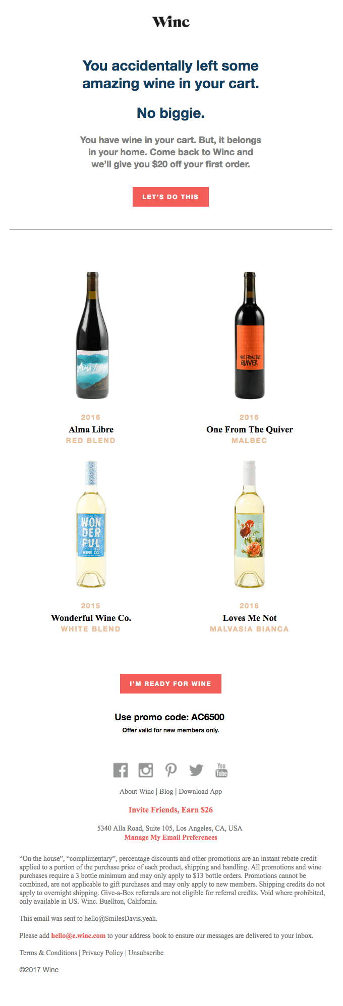
Winc understands that adding a discount to their cart abandonment email is a solid tactic to turn their almost-buyers into buyers.
They show the products that their users have left behind and motivate them to finish their purchase with a call to action at the top and at the bottom of their email.
We hope this post and examples got you all inspired. The main factor of a cart abandonment email is to motivate your customer to finish their purchase. So keep your email clean and simple without any distractions. Do you have any questions about cart abandonment or are you struggling with this? Let us know so we can help you out!